Trumpets, Tins, and Big Holes
Plus a much-needed charity makeover
Hi again, and welcome to the first Monthly Shell-Out following this publication’s rebranding 👋 In case you missed it, here’s the short update explaining the change:
To all the new people (because there are quite a few of you), this is my monthly round-up of interesting design bits I’ve found. Occasionally, I’ll send longer-form articles too.
Alrighty, here are the aforementioned cool things. Naturally, the first one is about food because I’ve written this while hungry:
The Fanciest Tomatoes 🍅
I think Mutti's marketing team is on a mission to turn us into tomato snobs, and I'll admit that I couldn’t be happier to be a part of it 🥫🧐
Back in 2017, The Florence/Milan-based Auge Design created some gorgeous limited edition tins that have jumped to the top of my all-time favourite packaging designs. With a stunning use of colours, shapes, and patterns, the tins elevate the humble tomato to heights (and prices!) we never knew we needed. Just look at the tomatarific patterns below…
Artsy tootling 🎺
On the 30th of April it’s International Jazz Day 🎹
You may think that’s a clunky segue into talking about some jazz-based design, and you’d be absolutely right — the consistently interesting Melbourne International Jazz Festival.
To me, designing for the same annual event is both exciting and nerve-racking; designers have the freedom to experiment and iterate, but the pressure of serving up something new and innovative every year.
So I admire that Motherbird, the agency behind the designs, excels in making something new every time. And somehow, they manage to maintain that distinctive ‘artsy music festival’ vibe. Toot toot. Plink plink.
Barnado’s Rebrand 🧒
For those who aren’t familiar with Barnardo’s (that’s everyone outside of 🇬🇧, 🇦🇺, , 🇮🇪, and 🇳🇿), they’re a charity all about supporting the wellbeing of children1. But after 16 years, their old brand identity was quite tired. A traditional serif font? Aspirational jumping figures? In 2024, it feels very “dated charity logo”.
Enter London-based brand consultants, The Clearing, who introduced a much more child-centric identity, focusing on communicating that Barnardo’s is a place for children to be free to express themselves; it’s not just about providing shelter.
I admire how successfully the agency has managed to apply the new branding to such a mind-boggling range of touchpoints — charity shops, uniforms, websites, social media — it’s a really wide-reaching campaign.

Of course, branding is so much more than the logo. Check out the full case study and learn about the excellent typography, iconography, and tone-of-voice work that helped form such a solid identity.
The Typography of Asteroid City ☄️
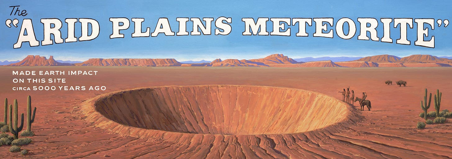
Finally, if you’re anything like the creative folk in my circle, you’re a fan of Wes Anderson films. The visual grandeur of last year’s Asteroid City was no exception, with beautiful set pieces and a polarising colour palette of teal and brown.
But if you're a fellow type nerd (or just someone who appreciates the artistry of a well-designed alphabet) check out this closer look at the fantastic hand-made type in detail, from the Anderson-regular designer Erica Dorn.
Conclusion
Thanks for reading — I hope you found something interesting in this little design round-up. I’m pleased to say that I finally have some longer-form/single-topic articles in the pipeline after a hiatus, so stick around for those if you’re interested.
But for now, I’m off to make a bolognese with some Mutti tomatoes.
The marketing worked.
Have a lovely April,
Tom 🐢
👥 Socials
👔 LinkedIn
📸 Instagram
🌍 My website
It would be irresponsible not to acknowledge that Baranado’s has had a significant amount of controversy for some of its actions throughout its history.


