

Offline Websites and Cuddly Cats
Plus eye-catching animation and snazzy icon-based rebranding.


A warm welcome to new subscribers — the 'cozy blanket' kind of warm, not a tepid, artificial salutation.
This boundless and exciting medium of words is expanding yet again with a different format. It’s a round-up of five cool things that I’ve really enjoyed over the past few weeks:

A website that you can’t read online 🔌
And it’s fantastic. I’m slowly making my way through Tom Greenwood’s Sustainable Web Design. An example site at the start of the book was Offline Only - a website that you can only read if you turn off your internet. I won’t say any more, as Chris Bolin’s words summarise the purpose of the site far better than I can.
The project also expanded into an offline-only magazine, making use of the same ‘disconnect to view’ mechanic.
This fantastic looping animation 🔴 🔵
Turn your sound on!
This awesome piece of looping motion graphic work on LinkedIn by Emanuel Peres represents the accompanying audio very satisfyingly. The schematic-style illustration style with subtle hatching, combined with the clever use of bold colour, works really effectively alongside the meticulous animation.
First Choice is looking snazzy 🏝️ ⛰️
Ragged Edge have rebranded First Choice. It’s modular. It’s iconography-based.
Cats Protection have a new logo 🐱
Sadly, I’m sort of on the fence about it.
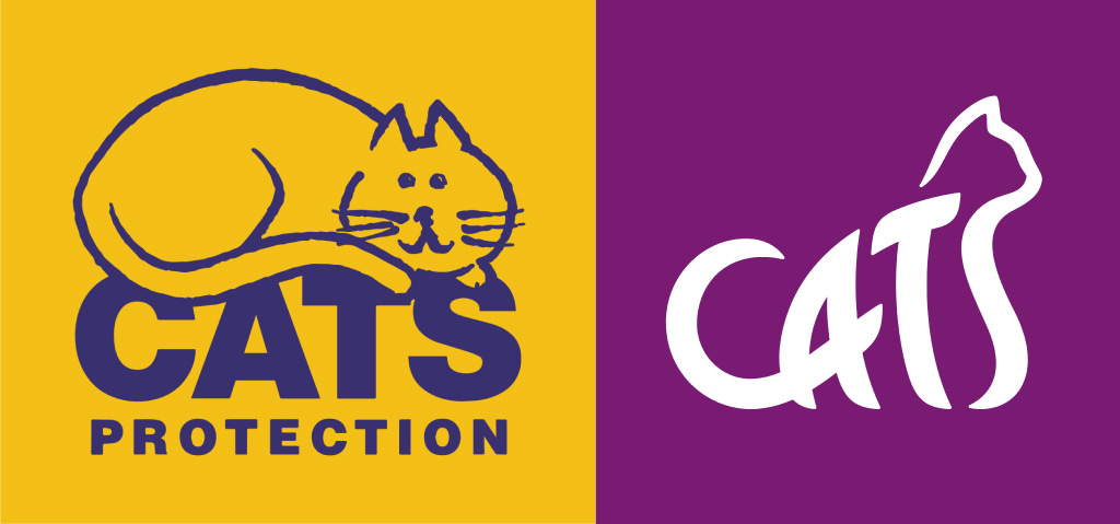
To those of you outside of the UK, Cats Protection is a charity that rescues cats. It’s in the name, I suppose.
On the surface, the new brand is pleasant and cat-like. However, it seems to lose out on the cuddly, cute, protective qualities of the old mark. It was 25 years old though, so a healthy dose of nostalgia might be why I’m so against change.
For me, something that’s more cuddly and protection-y would be Marina Willer’s Woodgreen branding. What do you think?
Surreal anti-design 📎 💬
The “we don’t have a designer” meme is pretty old hat now. But SURREAL cereal fully committed to clipart anti-design horror. A series of posters that - for better or worse - remind their target audience of simpler, Microsoft Officey times at school. Clippy never forgets.
Conclusion
I hope you enjoyed this roundup and found something new. Let me know in the poll below if you’d like more emails like this in the future. If not, I can retreat into my turtle shell of typography terms that sound rude.
Tittles,
Tom 🐢

👥 Socials: Follow me for more updates:
👔 LinkedIn
📸 Instagram
🌍 My website
Hey Tom! I found your newsletter through a directory on the r/substack reddit community. This is so fun, and your writing is so lighthearted! The new Cats Protection logo reminds me a lot of the WWF panda logo, which always felt distant and corporate to me. The offline mag is very cool, I had no idea that's even possible to do. I'm in a UX bootcamp at the moment so finding things like this to expand my knowledge of the field is always welcome. Best, Lala