

Tracks, Beans, and Trees
Pentagram, FutureBrand, other-worldly coffee, and a sad train obsession…

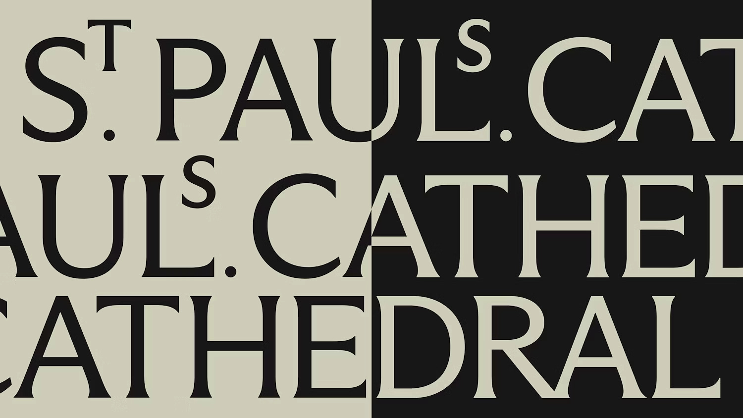
1) Pentagram x St Paul’s Cathedral 🏛️
Pentagram’s work on St Paul’s Cathedral is my favourite brand release this month.
The work hinges on close collaboration with stonemasons to create a bespoke typeface with some lovely archaic flourishes. That and I’m a sucker for a monogram. Exceptional work.
2) UFO Bean! 🛸
Turkish agency Venore went full flying saucer with this coffee packaging concept that’s unlike anything else on the shelf.
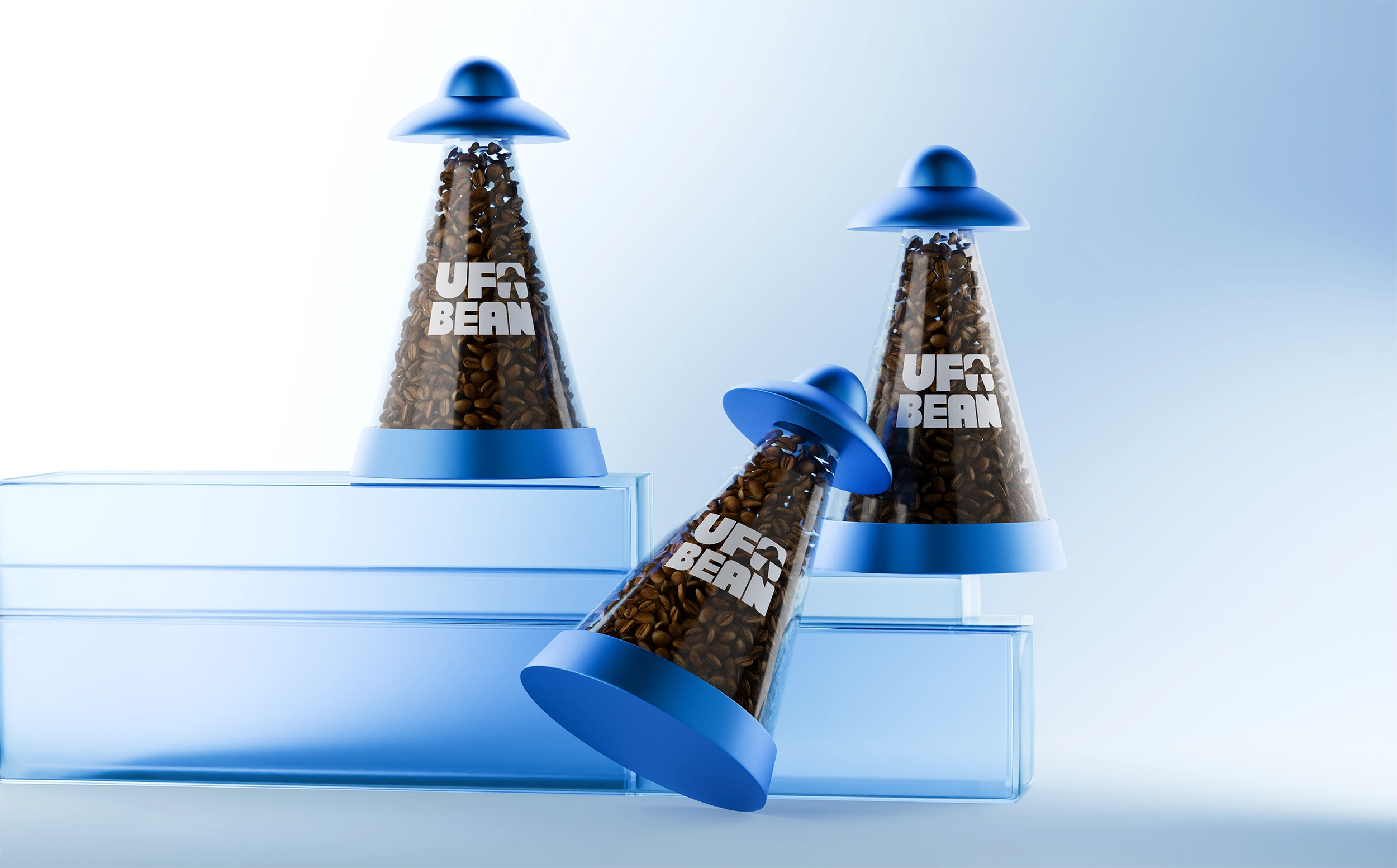
But it’s not perfect, to be honest. The physical shape is doing the heavy lifting here, and I’d be interested to see how the typography could have been pushed further. Think 1950s sci-fi — lots of room for expressive type that would double down on the fun factor of the unique shape.
That and concerns about sustainability, as it looks like a lot of plastic for transporting fewer beans than the recyclable bags I’m used to.
3) AI Microwaves
A quick shout-out for anyone that didn’t see my thoughts on generative AI from a few weeks ago. Essentially, you can be sure that these emails are going to celebrate human creativity and not add to the “Design is dead!” narrative that stresses us all out.

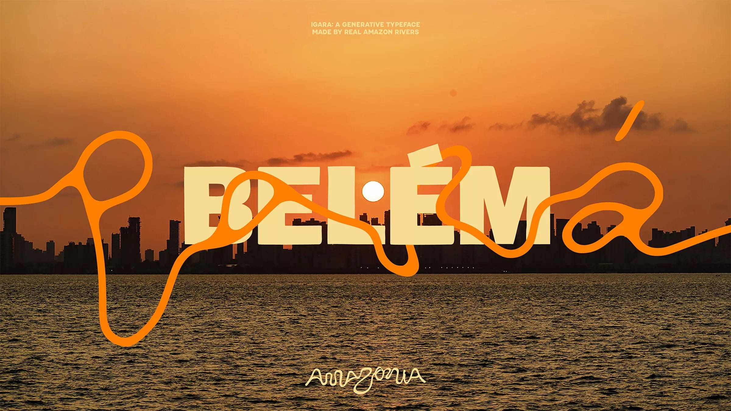
4) The one everyone’s seen already 🌳
FutureBrand’s destination branding for The Brazilian Amazon was everywhere in April. A brand identity created from actual river shapes.
However, I feel obliged to highlight the contradictory nature of FutureBrand also working for Nestlé, a company that really struggles with not being evil.
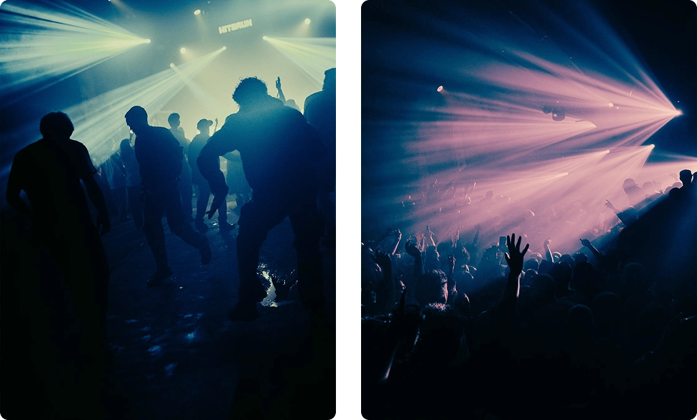
5) In the cloooob 🕺💃
Sophia Carey’s club photos are siiick, m8. The Manchester-based photographer captures the kind of images that evoke feelings, not words — something Carey explains in their deeply reflective Substack essays, if you want a longer read.
The silhouettes, grain, and two-colour palettes feel very screen-print-like, and reminiscent of the moodboards with Olly Moss work plastered over them by students a decade ago.
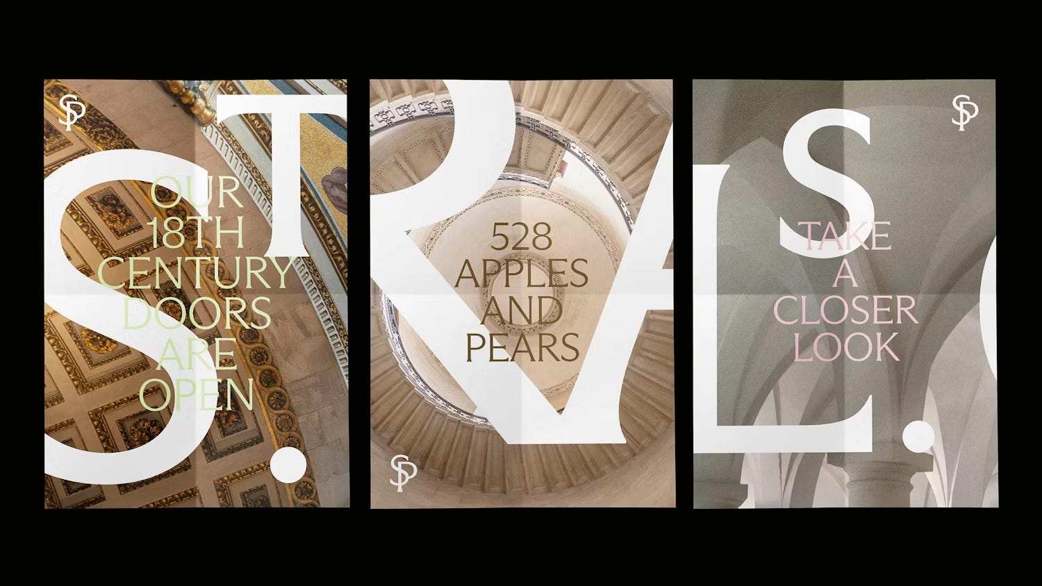
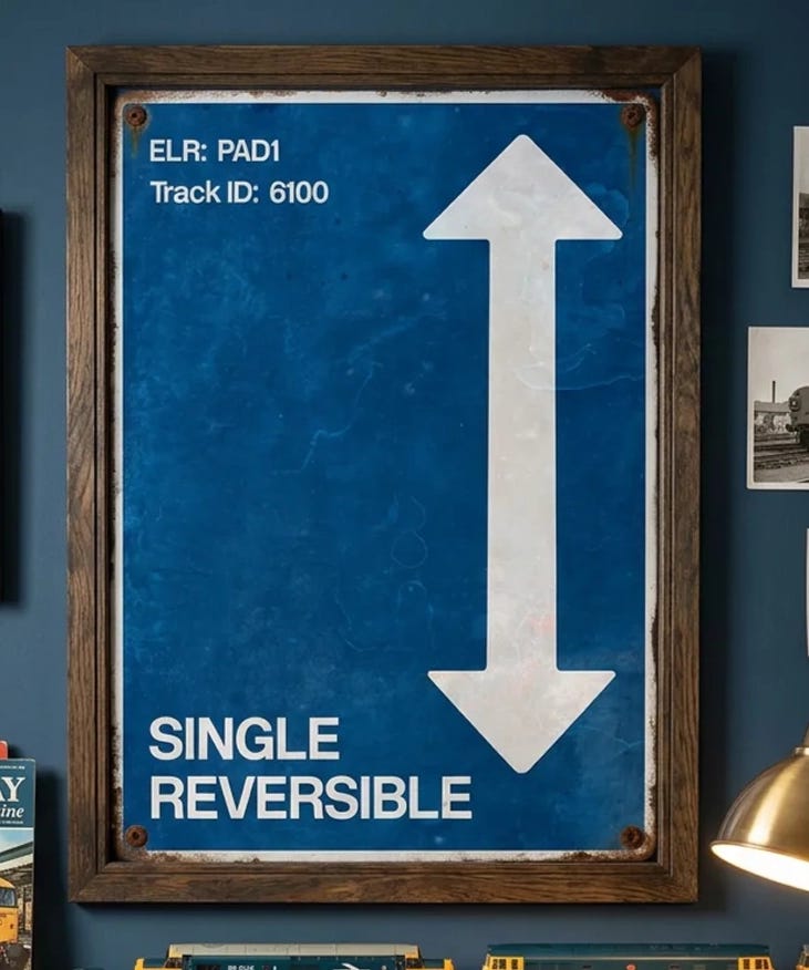
6) Trains 🚄
If you know me personally, you’ll know that I’m a train enthusiast, in part due to the extensive design systems associated with them. BUT WAIT, please keep reading.
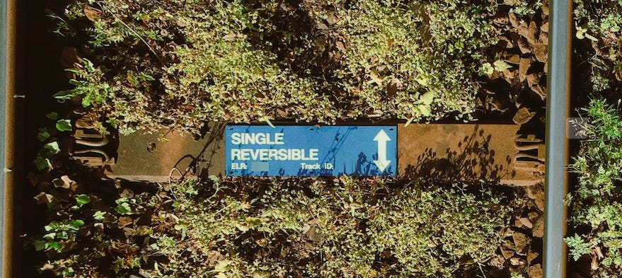
I noticed a track ID marker while waiting for a train, and appreciated the bold sans-serif Rail Alphabet treatment of the information. And immediately thought about how it would look as a poster. Lo and behold, I turned it into a poster.

Thanks for reading.
Six creative things! Hopefully at least one of those left you with the desire to make something :) As always, feel free to reach out if you spot something cool for next month.
Best wishes,
Tom 🐢

Noice m8. Good selection and love the poster!