Highway Hieroglyphics: The Type Behind the Signs
How the typography choices on road signs steer your journey.
Road signs! Infrastructure! They’re ubiquitous — boring to some, but a really interesting UX case study, and a great thought experiment to practice evaluating solutions to a problem. Spoiler: some of them are terrible.
Typography makes a big difference.
For me, road signs are some of the most noticeable shifts in visible design systems when I’m in other countries. Type is a big part of this. While the Transport typeface became a global standard after its UK debut in the 1960s, there’s a world of diverse type elsewhere.
In fact, you’ll find some of Jock Kinneir & Margaret Calvert’s Transport in a huge number of road sign designs outside of its native UK, including Spain, Italy, the UAE, and even with extended alphabets in Greece and India. Cool, huh?

This has something to do with UX, I promise.
When it comes to thinking about the user experience of road signage, you’d expect the typography to generally offer these qualities:
Legibility — Characters you can read on the road, even from a long way away.
Readability — Words you can read quickly, reducing the time your eyes are off the road.
Consistency — Reliable presentation that avoids confusion with other text you might see when driving.
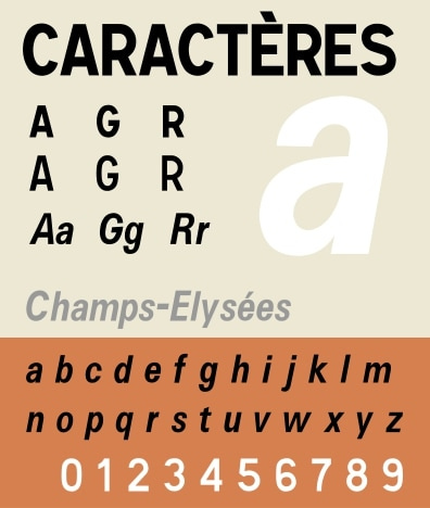
So with these ideas in mind, would your first thought be to go for four different typefaces, different weights, and mixed-case italics? Strap in for French road signs.


Maybe it makes sense initially: use different styles of type for different contexts. You’ll see different typography used on motorways/major roads everywhere in the world. But it just doesn’t feel like a design system that’s fit for purpose. I would love to see what a modern take on these signs would look like — there is absolutely room for a well-designed and uniquely French sign system, but I’m sure the associated costs will keep it out of reach until the time that road signs evolve into something new…
Something new?!
Fast forward another 50 years to 2073. Will road signs look the same? Here are two scenarios:
The likely (but sad) one.
Physical signs are obsolete. AR and HUD interfaces are the norm when driving. There’s no need to innovate or create new real-world signage.
The exciting (but unlikely) one.
The future is now! With all road navigation handled by machines, traditional road signs have gone the way of the dodo. They’re replaced by real-time, adaptive signs that cater to drivers' specific needs. The cost of changing the design of a sign is the time it takes to upload a new design, but the real cost is initially replacing every road sign with a flashy smart one.
TL;DR
Typography is the unsung driving force (ha!) behind all road navigation, at least when viewed through a Western lens. Smart design system choices made in the 60s still hold up today.
Maybe take a closer look at the signage next time you’re stuck in a traffic jam.
Thanks for reading,
Tom 🐢
Thanks for reading! If you enjoyed today's post, feel free to share it with friends or colleagues. Any feedback? I'd love to hear from you.
👥 Socials: Follow me for more updates:
👔 LinkedIn
📸 Instagram
🌍 My website


