


Hello again, and happy July 👋
In this month of cool things: pumpkin-smashing, a whole lot of moving stuff, tYpoGRapHY, and smudgey gubbins. It probably makes more sense to see for yourself 👇
Blowing hot and cold 🎏
I found Japanese studio weplus’ installation called Straordinaria. It’s 1300 weighted mesh fabric tubes, blowing in the breeze of an Italian courtyard.
This was for, of all things, a kitchen design company. The rationale for the art is along the lines of the evocation of warm and cool air. I hope I can persuade you to take a minute of your day and watch pretty colours.
Nostalgia for a non-existent childhood 🎶
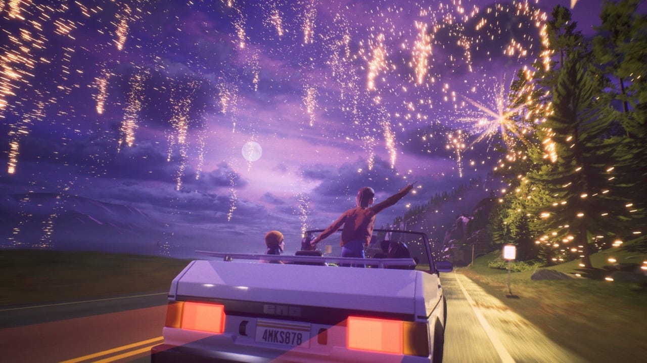
The video game Mixtape tells the story of three teenage friends’ last day together in 1990s small-town America, built entirely around a curated soundtrack of The Smashing Pumpkins, Iggy Pop, Joy Division, and more. The aesthetic and animation carries that Spider-Verse-esque stop-motion feeling, and the edit feels a little Wes Andersony in its fourth-wall song introductions.
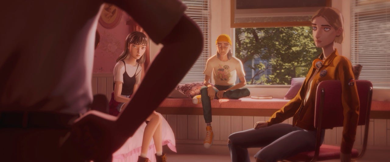
Mixtape dodges the cheap nostalgia-bait most media reaches for; I found myself longing for a childhood in 1990s America, which is impressive considering it was actually in 2000s Britain.
It’s available on PC and basically every console.
Smudgey gubbins ✏️
Over on Instagram, I saw stop-motion charcoal drawings for the first time thanks to @visualsbyls. I don’t think I possess the patience (or skill) to spend a month on an animation.
Everything moves now 🎥
Figma Motion lets me make fancy animations directly inside the tool I already spend most of my time in. Gone are the barriers to entry that many junior designers and students encounter when opening After Effects’ janky, outdated UI.
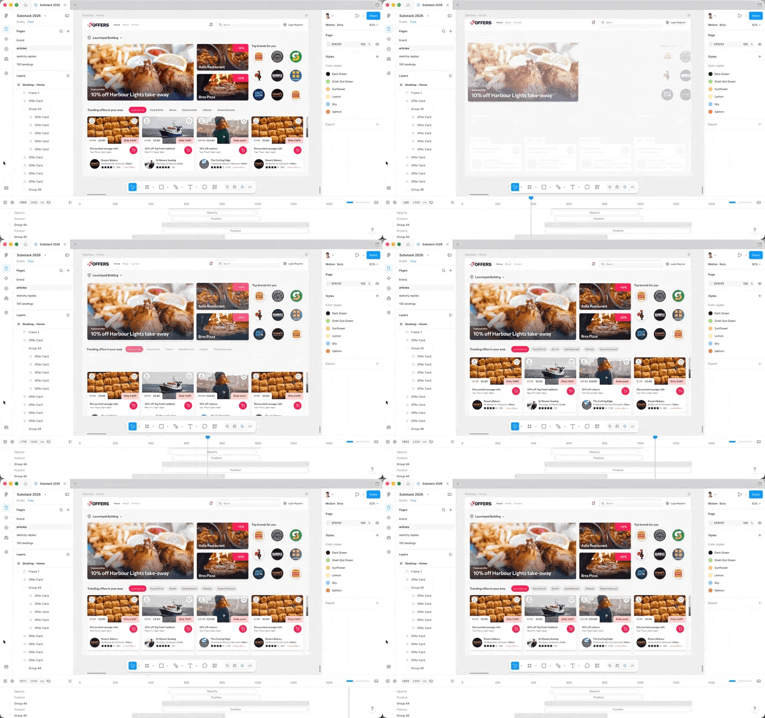
If you like motion design, Nikita Prokopov's article Every Frame Perfect is worth reading alongside this. His point is that most UI looks fine at rest and broken in motion, because people design the start and the end and skip everything in between. Now that the in-between is something a whole bunch more of us can actually see, there's less excuse to skip it.
Not Very Nautical 🚢
How&How rebranded the SS Great Britain (a famous old boat, for international readers) into a cultural destination called Bristol Dockyards. The hero colour is a pink taken from the colourful painted terraces of Bristol; a deliberate deviation from the sea of ocean-themed colours.
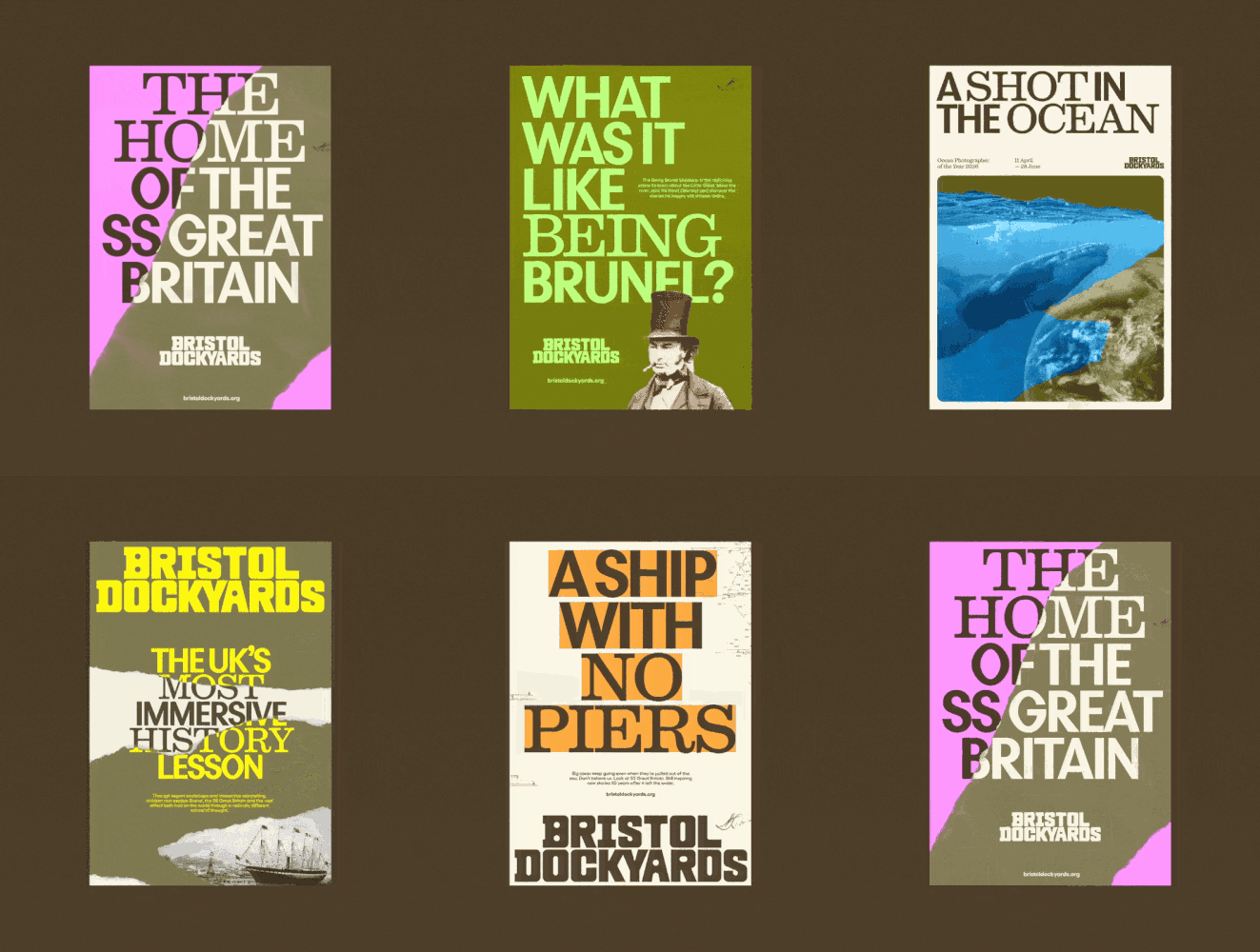
The identity runs on a collage system, representing the merging of 200 years of history, with letterforms shifting between classic serif and a semi-bold sans depending on context. Ripped paper is a lovely aesthetic.
miXEd cAsE tYpe 🧽
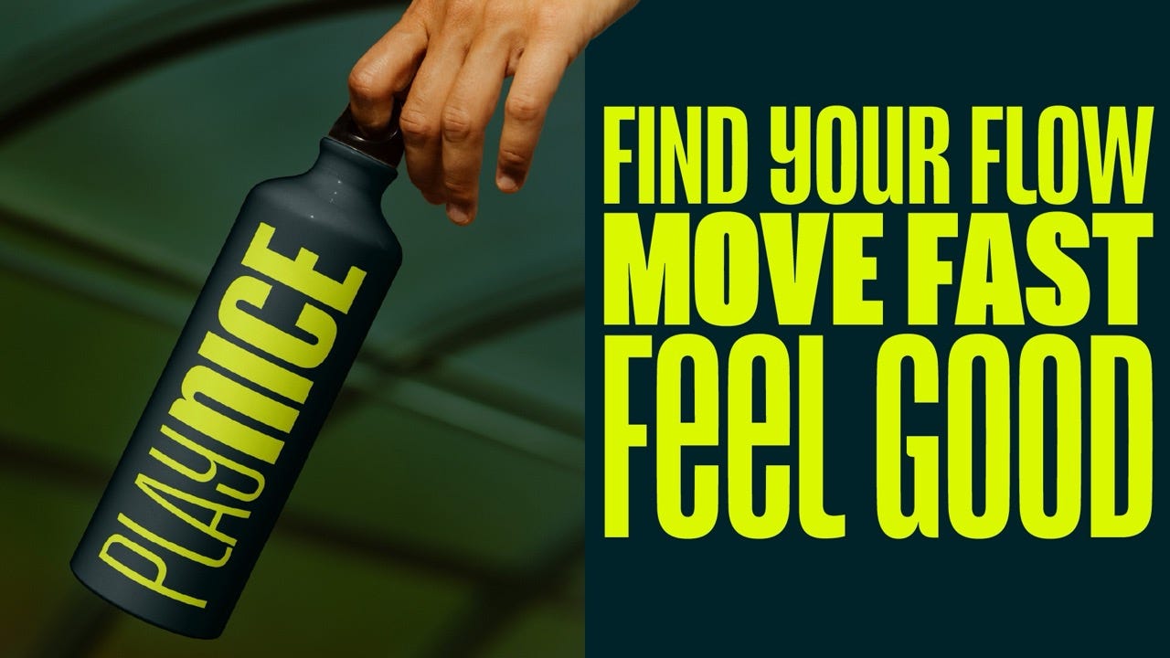
Reel, from typographer Jamie Clarke, has lowercase and caps sharing the same height. You can play around with mixed case layouts to inject some character and make ALL CAPS feel a little less shouty. Delightful.

Thanks for reading 🤗
May your July be as peaceful as 1300 weighted mesh fabric tubes in Italy.
Best wishes,
Tom 🐢
