Hi again 👋
Hope you’ve enjoyed the last month. I’ve been training with new design tools, eating fancy pasta, and I even heard a duck do a fart — only the finest journalism in this newsletter 🦆💨
In an exciting accessibility revelation, this newsletter comes with full voiceover, too. With just a tap, you can listen to my vocal cords wobbling about, if that’s the kind of thing you’re into.
Alrighty. Here are the cool things from design and tech that I’ve found over the last month 👇
Swiss Museum of Games 🏰
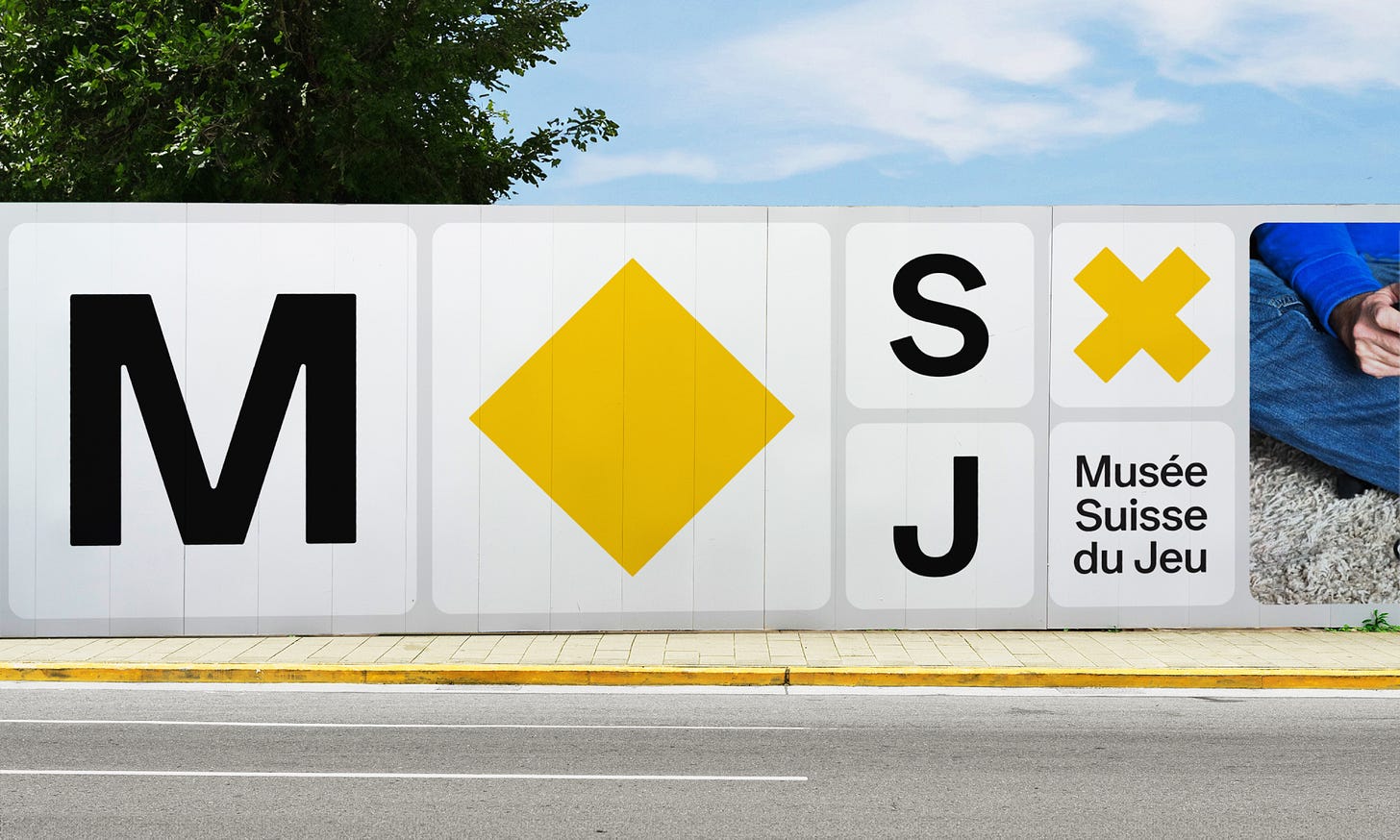
The charming 13th century castle of La Tour-de-Peilz sits serenely on the shores of Lake Geneva. Inside, you’ll find the Swiss Museum of Games (Musée Suisse du Jeu), a celebration of all things ‘play’ since 1987. But in 2023, it was time for a fresh new look.
Swiss studio Hymn faced a big question: How do you celebrate thousands of years of games and fun in a way that appeals to everyone?
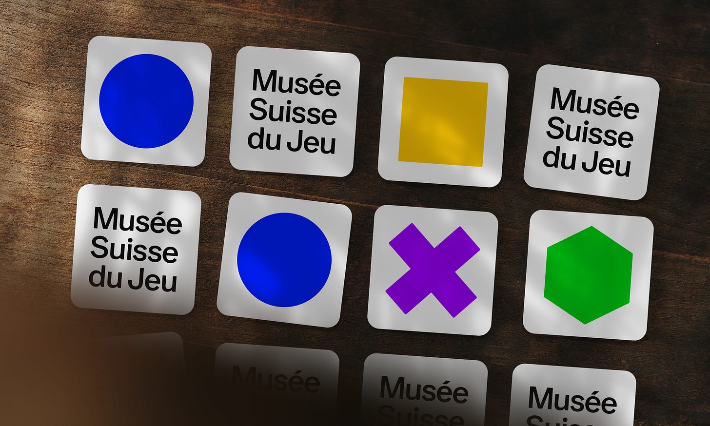
Without relying on dated clichés like chess pieces or playing cards, the new identity draws inspiration from the world of tabletop games. Simultaneously reminiscent of dice, counters, and tiles, the white building blocks feel like the universal language of games, capturing the spirit of play in its simplest visual form.
In true Swiss design style, you’ll find a beautiful grid system adorned with typography set in Ease, Helvetica Bold’s trendy rounded cousin. Overall, a great answer to a tricky brief.
Clicky-clacky noises ⌨️
In the world of software/UX, Mechvibes is a free and open-source app that adds custom sounds to your key presses. If you’re a mechanical keyboard enthusiast, I’m sorry for how offensive this idea seems, but…
Adding audio feedback to ‘silent’ keyboards is great for accessibility.
There’s an extensive sound pack library offering a huge selection of clicks, clacks, and meme noises (while impractical, the Isabelle Animal Crossing pack was hilarious).
More road signs 🚧
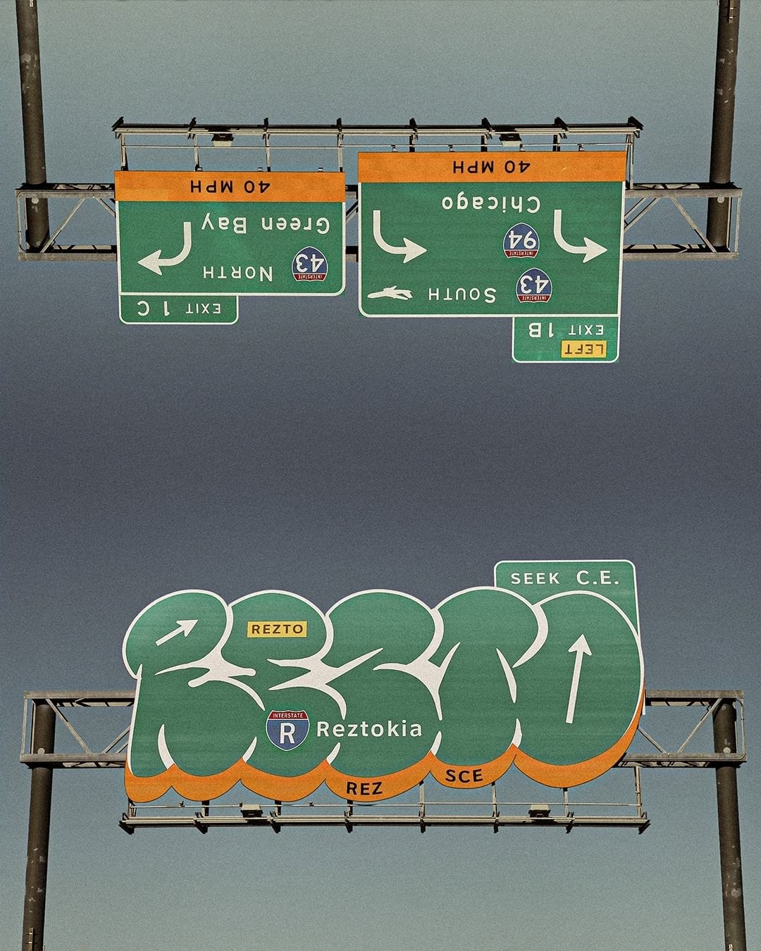
It sounds arty and pretentious, but one of the things I enjoy about typography is how often it can help creatives push beyond the confines of ‘everyday’ designs. From speedy tags to elaborate commercial pieces, graffiti has long been a source of experimental typography, with an aesthetic often defined by the environment in which it is constructed. Which is precisely why this design from Philip Rempel (or REZTOKIA) caught my eye.
And yes, I’m aware that this is the third time I’ve featured something to do with road signs. You just can’t argue against a good bit of infrastructure, y’know?
An art teacher would say:
“Rempel’s clear influence from the readymade and objet trouvé movement blends the subversion of expectation with known graphic standards.”
I’d say:
“Ooh. Road sign looks like graffiti, innit?”
Carbon-negative searching
I first used the eco-friendly search engine Ecosia in 2014. Back then, it suffered from being powered by Yahoo, and the lack of quality search results had me reluctantly trudging back to Google after a few days. But last autumn, the search engine improved significantly by integrating results from Google and Bing, allowing you to choose your favourite provider.
After using it this month, I found it to be an easy swap. It’s a privacy-focused service that’s good for the planet and provides near-identical search results. It’s already built into most browsers and phones as a search option, so try switching over. The Lorax will thank you 🌍✨
Conclusion
Thanks for reading — this month’s edition has been a little longer than normal, but there was just so much great stuff to share!
Whether it’s rekindled your desire to visit Switzerland, made your keyboard make clicky noises, or encouraged you to switch to carbon-negative searching, I hope you’ve found a spark of inspiration somewhere in this newsletter ✨
And I hope you have a wonderful June. Remember to exercise caution when standing behind bloated ducks 💨
Best wishes,
Tom 🐢
👥 Socials
👔 LinkedIn
📸 Instagram
🌍 My website


