Designing Space Mission Patches
How Katherine Bjelke turns space missions into wearable insignias
Nearly every space mission has its own patch; a passport stamp that carries the hopes and aspirations of the team on their sleeves, often literally. While the tradition began during the Space Race, the patches themselves have much older origins, such as the Roman Empire’s military insignia.
I spoke with Katherine Bjelke, a Copenhagen-based visual designer with a similar love to me for space. They’ve designed a plethora of space patches, with my favourite being for the Alisio 1 cubesat. Here’s what they had to say about their practice:
I’m guessing you’re a huge space enthusiast like me — how did you land your first space-related design brief?
“Yes, I am! Funny enough, it all started because I wanted an Apollo 11 poster, but I couldn’t find one I liked (or could afford at the time). So, I thought, “Why not make my own?” That got me into a whole series of space-inspired designs. Eventually, other space fans noticed and I got approached by TEIDESAT—a student cubesat and outreach project—to help with their designs. From there, one thing led to another, and I started working with more space-related projects and other companies.”
What’s the process of designing a mission patch like? What challenges come with the medium?
“Designing a mission patch feels a lot like solving a puzzle. It's like trying to tell an entire story in a super tiny space.
I usually start by talking with the team to understand the mission’s goals, symbolism, and any must-have elements they want included. Once I have the pieces of my puzzle, I sketch out different layouts and ideas, without making the design too crowded and take it from there.
The tricky part is the size, patches are usually around 8–10 cm. On top of that, you’ve got to think about the practical side, like whether it’ll be embroidered. For example, lines need to be a certain thickness, gradients might not be possible, and some manufacturers even charge per color, those are things you need to discuss with your client first, some will only have their patch as a sticker and that will give you a bit more freedom.”
Space missions often have enormous teams behind them — how do you create a design that represents the collective work of so many people?
And is it a challenge to make it something that the average non-space-enthusiast can enjoy too?
“I always design with the team in mind first. They’re the ones putting in the sweat and tears, I want the patch to feel like a celebration to them, so I try to include their little inside jokes or some easter egg that maybe only the team and people close to the mission can understand, while of course making something that explains the mission, and resonates with a wider audience, whether you’re a space expert or just someone who thinks it looks cool and wants to support the mission and the team.”
What styles influence your posters and patch designs? I’m getting a mix of Art Nouveau and Retro Futurism?
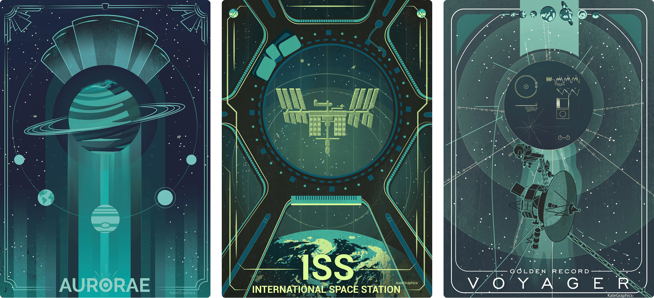
“You’ve got a great eye, that's exactly right. I’m a sucker for Art Deco, Retro Futurism, minimalism, and anything geometric, but honestly inspiration comes from everywhere. I think I based the top part of the Auroras poster on a lamp I saw at a restaurant for example, so it's not too weird seeing me taking photos at random objects I see while Im out, from lamps to plants to any funky shape. But I definitely lean towards Art deco and geometric styles.”
Finally, if you could make a mission patch for any sci-fi space mission, what would it be, and how would it look?
“That’s such a great question! I haven’t thought about it in detail, and I think I would have trouble choosing, it would be fun to make something for Interstellar with the Endurance and the wormhole or the black hole in the middle, in a very minimal design, but would also love to do any of the thousand cool concepts from The Expanse or the Wayfarer Crew patch from Becky Chambers’ Wayfarers series.
Not sure how they would look just yet though, I guess I'll have to make them all to figure it out.”
You can see more of Katherine’s work on their website.
Thanks for reading,
Tom 🐢


I’m a big fan of Katherine’s ( @kategraphics ) graphic style and color choices. It’s great to see someone with such talent get noticed in the space community.